
BRIEF
To produce a poster for digital purposes, in order to promote the release of the new typeface, Lisbeth, by TypeTogether foundry.
RESPONSE
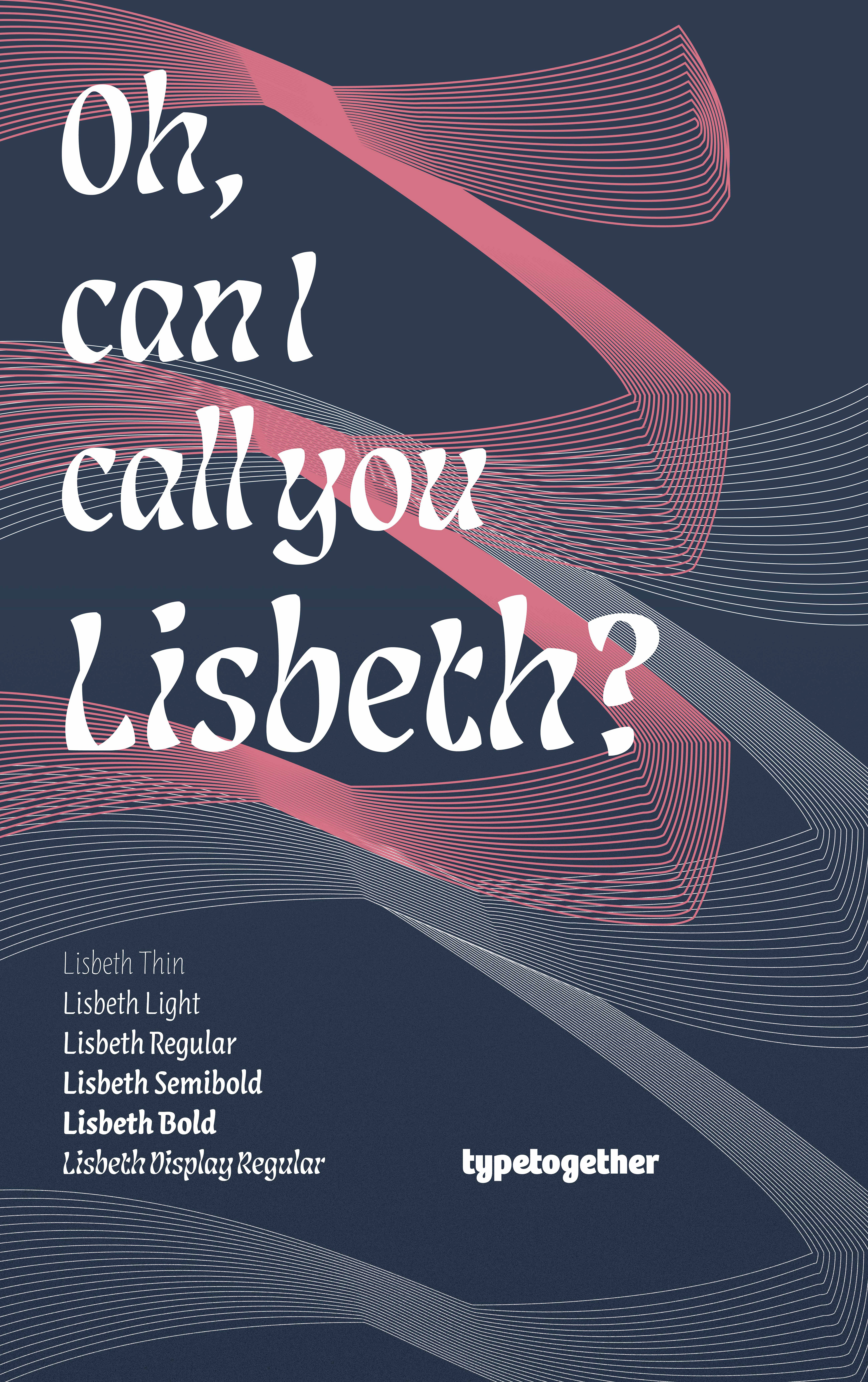
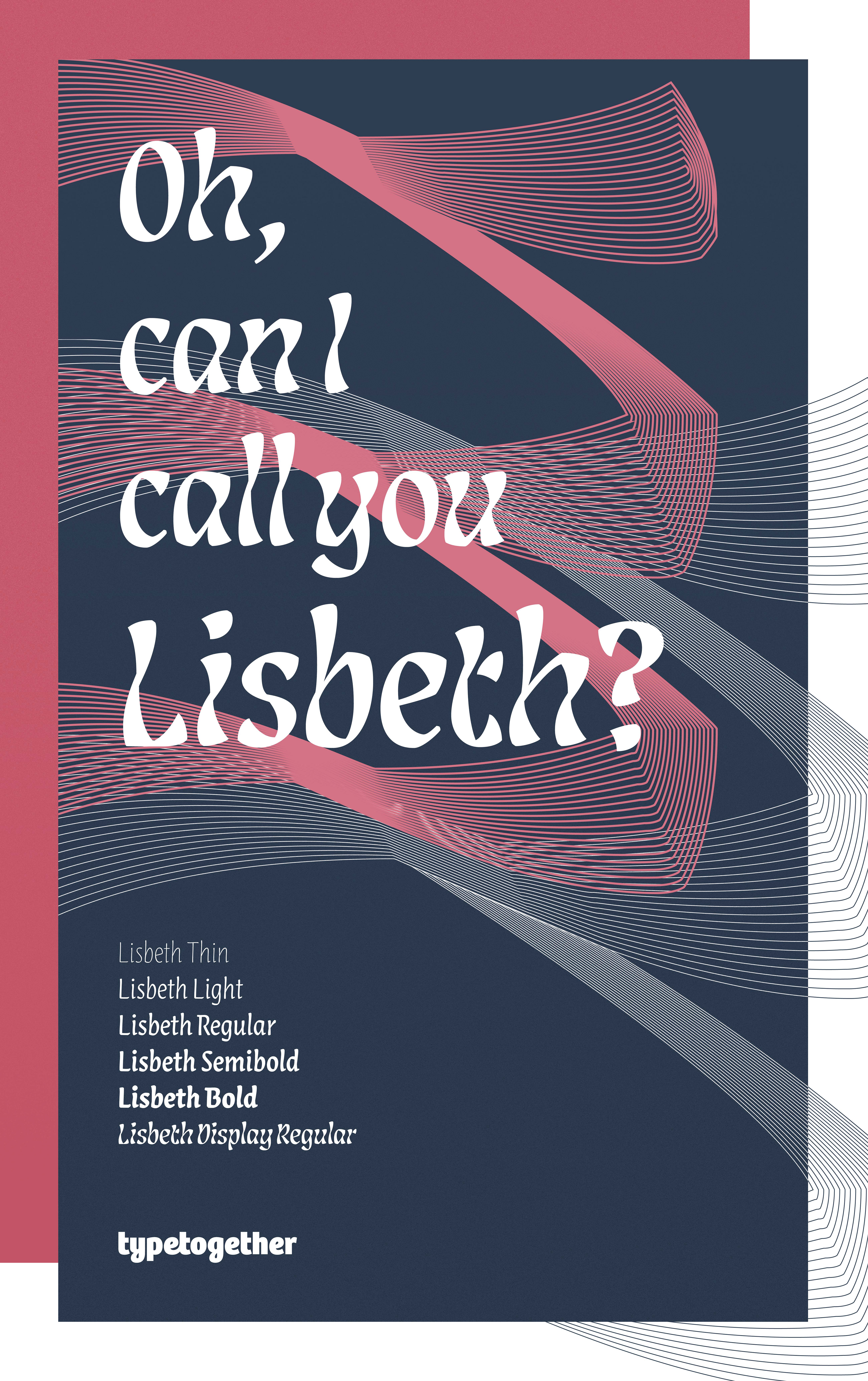
Through lots of experimentation using only typographic elements from the Lisbeth typeface, created a poster using only three spot colours and a minimal approach, designed to draw focus on the characteristics of Lisbeth.
PROCESS
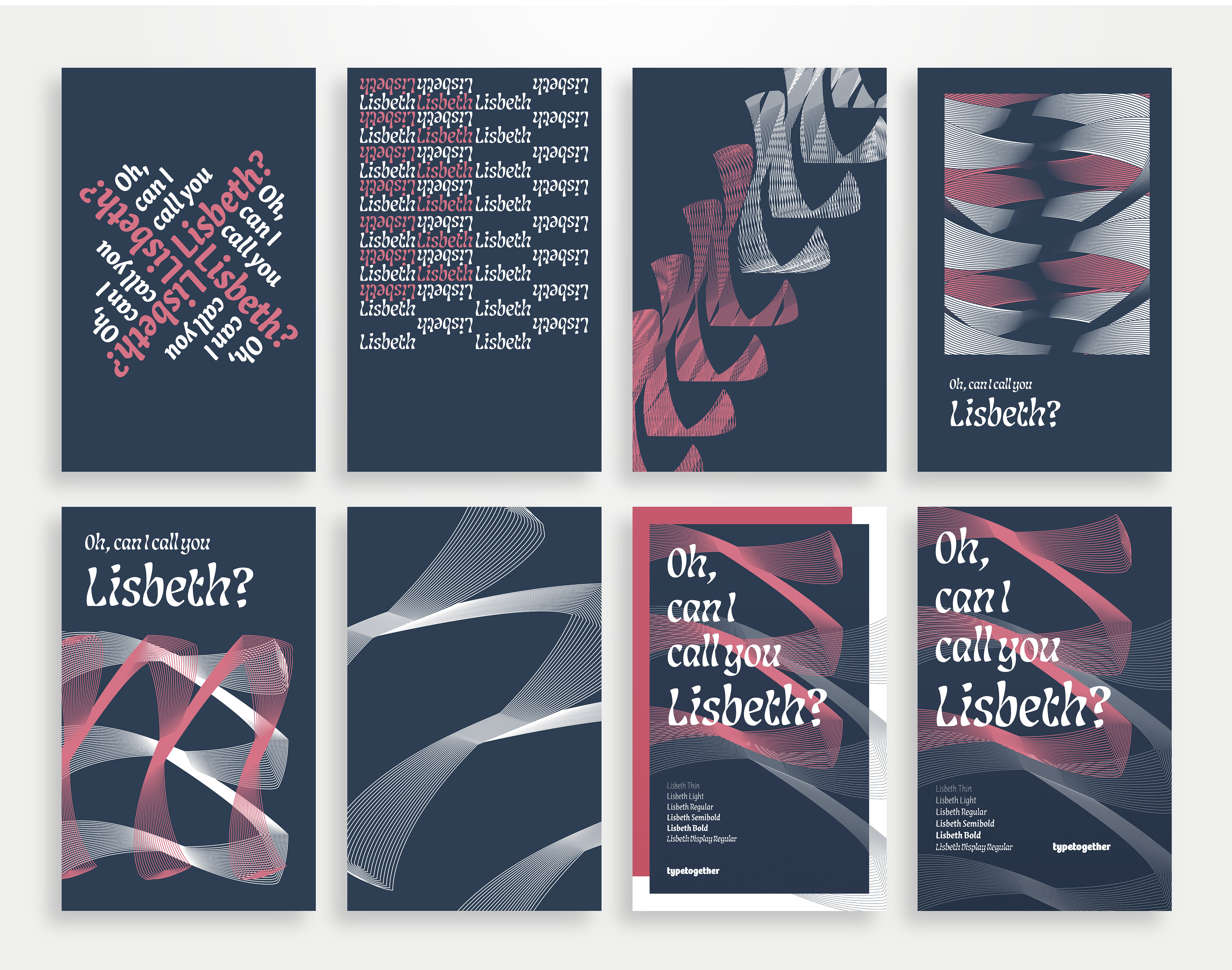
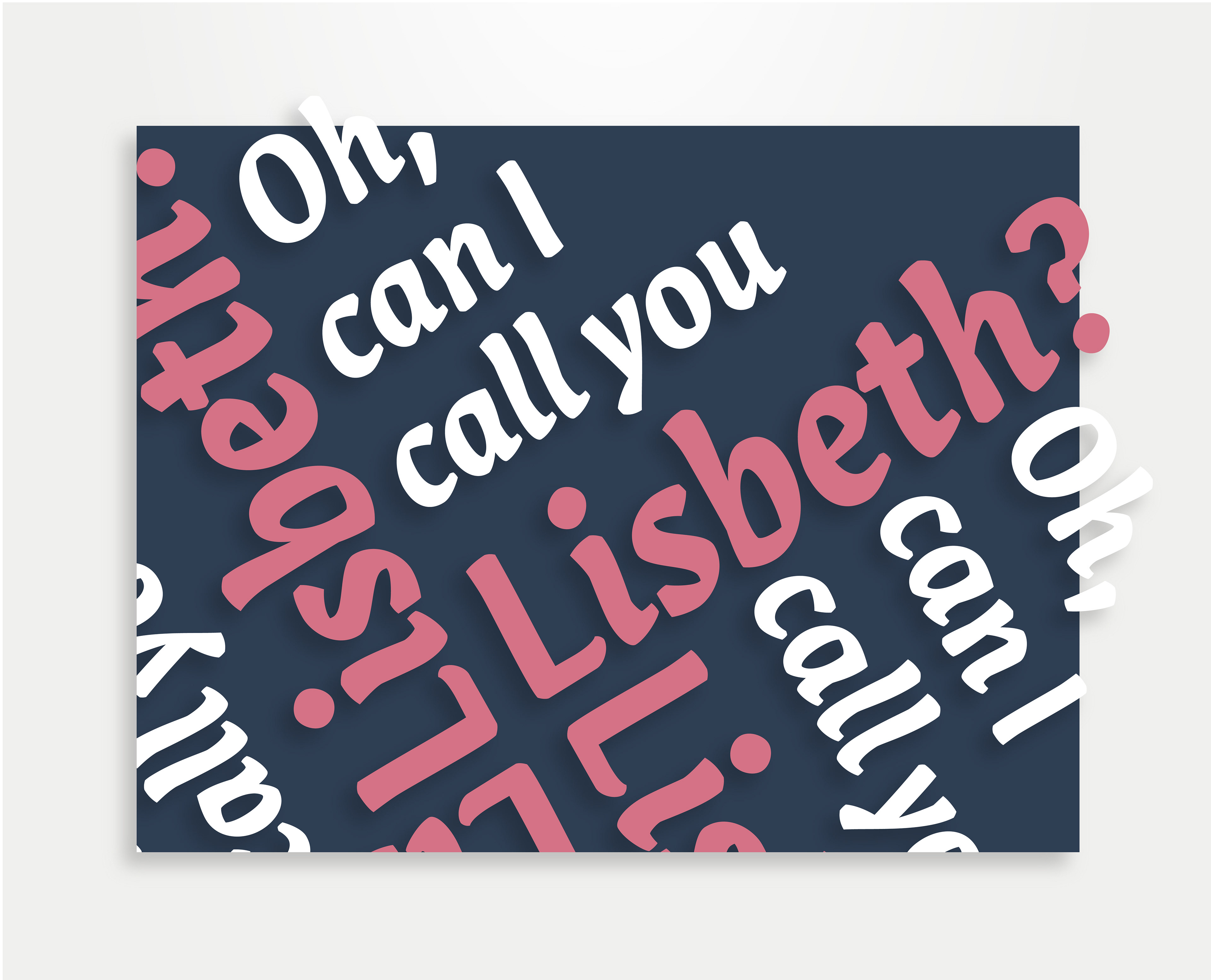
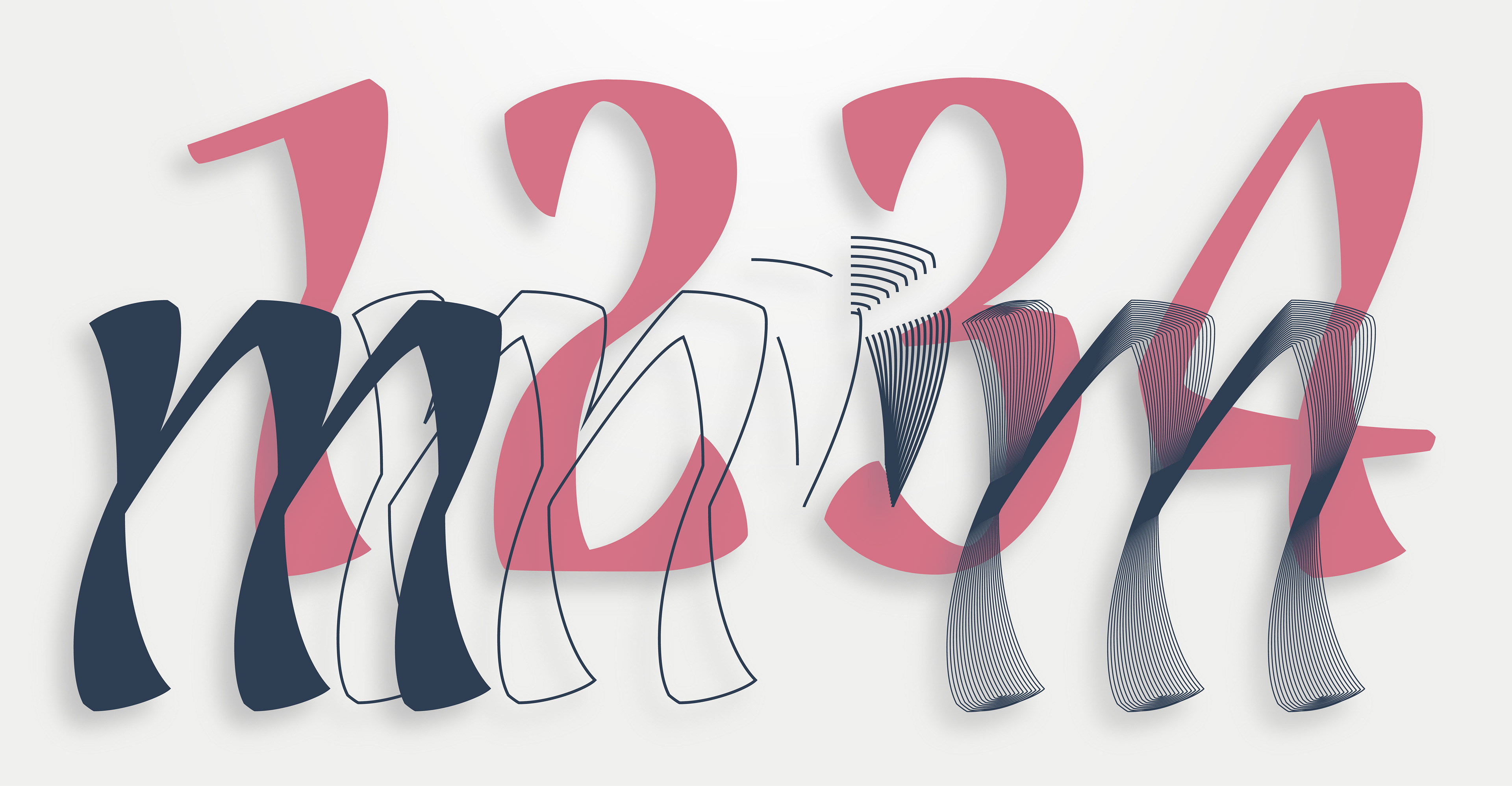
I started working on the poster experimenting with type, using a short quote that was taken from the movie The Girl With The Dragon Tattoo. I mainly played around with the allignment and placement of the type to create a pattern, in order to highlight the curvy 3D-like design of the display font of the type family.
The problem with that approach was mainly that it didn't showcase the unique characteristics of the display font, which were the twisted curves used in its design. In order to fix that, I focused on creating a graphic that would take up most of the poster, based on a single letter design.
TWISTED LINES GRAPHIC
Upon changing my approach, I started working with the blend tool in order to create a blend between the parallel lines of the letter 'm'. It was a lengthy process due to the fact that the lines produced using the blend tool did not always allign propery between them.
Nevertheless, all lines were properly alligned and joined, in order to keep the shape and structure of the type intact. Keeping the integrity and design of the typeface was the most important aspect of the poster, and the limitations that come with that were a fun addition to the design process of the final result.
FINAL OUTPUT
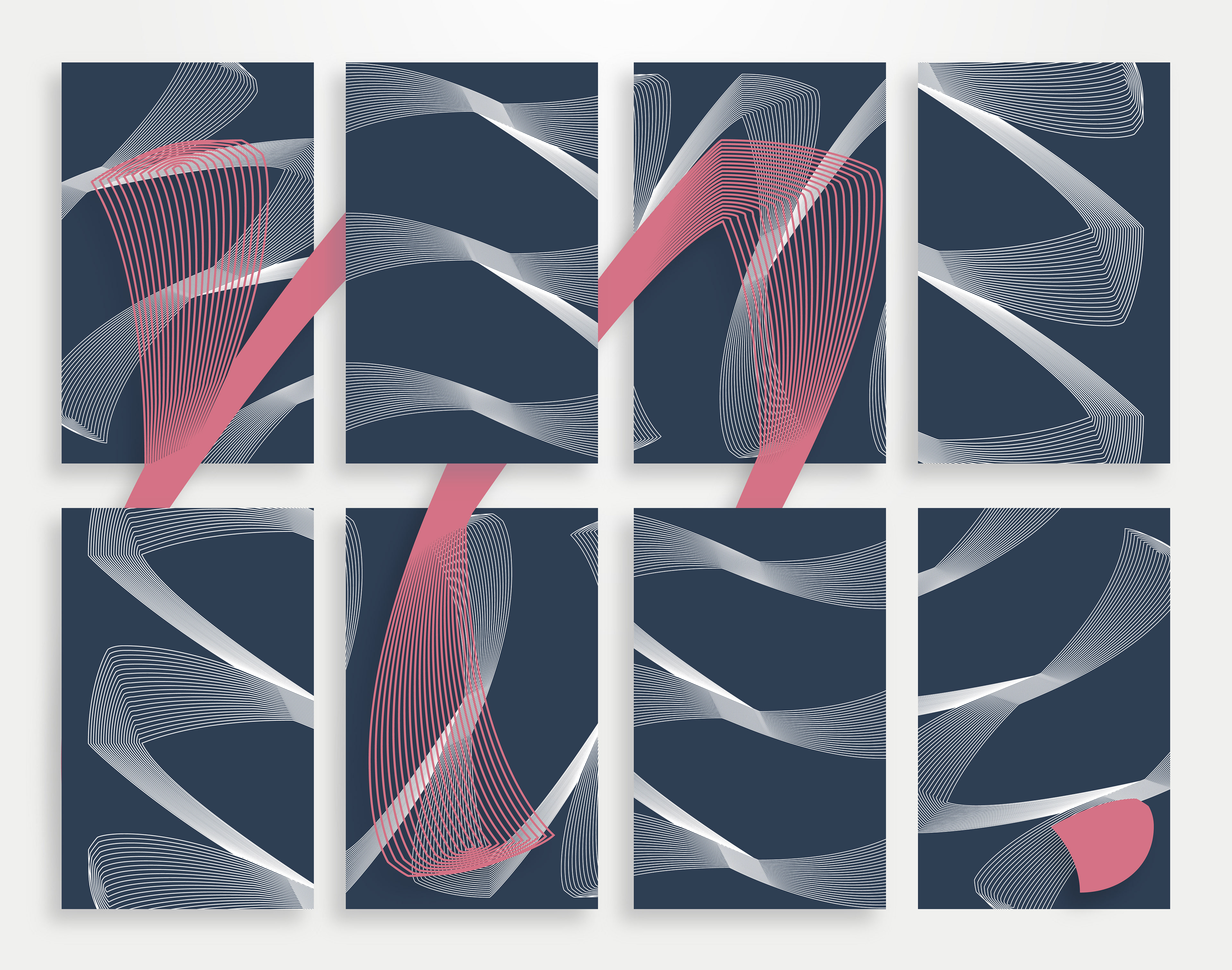
Two final posters were produced with small variations in layout. The poster features the edited 'm' letter twice, with varying stroke size, a subtle grain effect on the background, and a showcase of the various fonts in the typeface along with the original phrase from the early stages of the project.
More can be read about the process of creating the poster and the competition, along with the other submissions in the competition:
More can be read about the process of creating the poster and the competition, along with the other submissions in the competition: