
BRIEF
To launch your own indie magazine publication of any theme, along with an accompanying website blog.
RESPONSE
Reload Magazine is a bass music and culture magazine, centered around the UK Bass scene. It focuses on the culture & history of the underground scene, while also keeping with contemporary topics of the industry like specific artists, albums record labels and music promoters.
Reload offers longer and more thorough pieces of writing and content in order to bring to light the people behind the scene and their stories. The name of the magazine is derived from a specific habit in bass music, where DJ's rewind a track in response to the crowd's reaction.
BRANDING
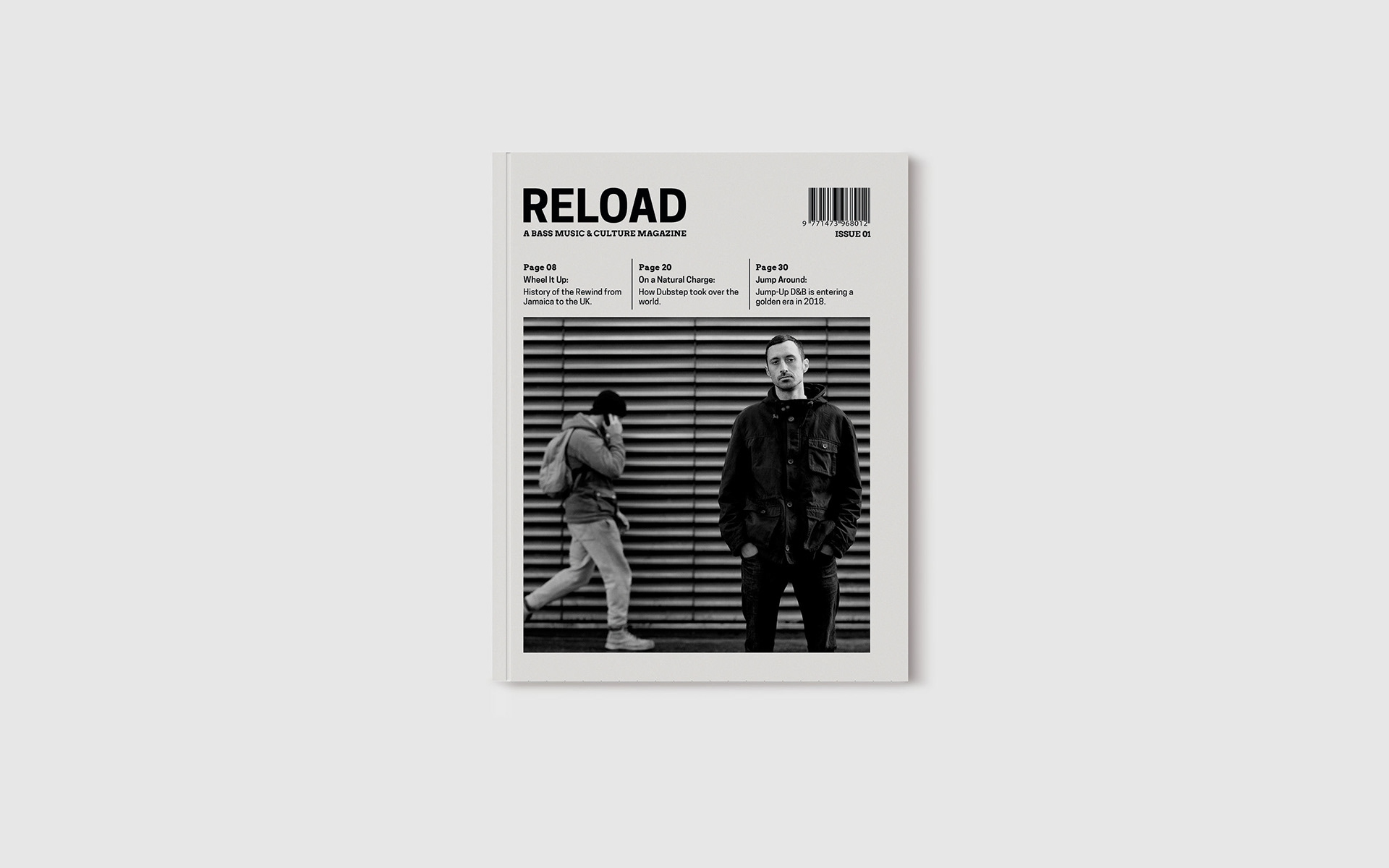
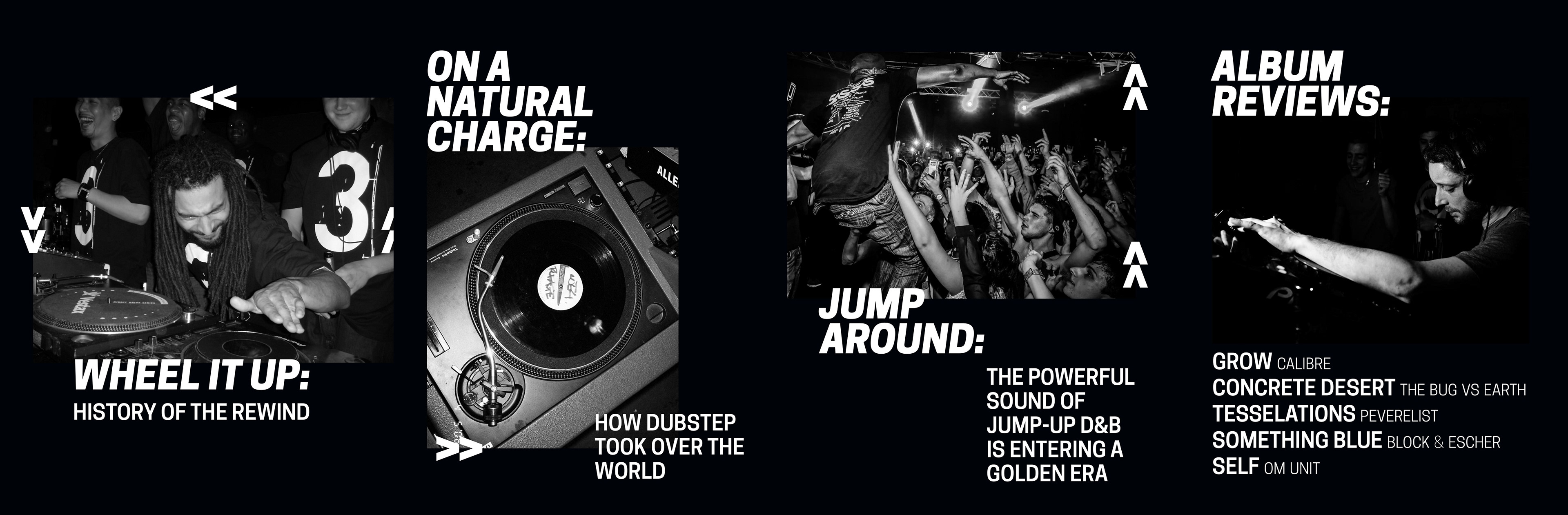
The visual identity of the magazine aims to reflect the aspects of the bass music scene itself: dark, gritty, minimal and heavy. As such, the magazine focuses on black and white and bold sans serif typefaces.
TYPOGRAPHY
Throughout the magazine and blog, there are only 3 typefaces being used: Cooper Hewitt, Arvo & Montserrat. All three typefaces are available for free and open source, which I found appropriate to an underground music magazine that supports the people behind the scene.
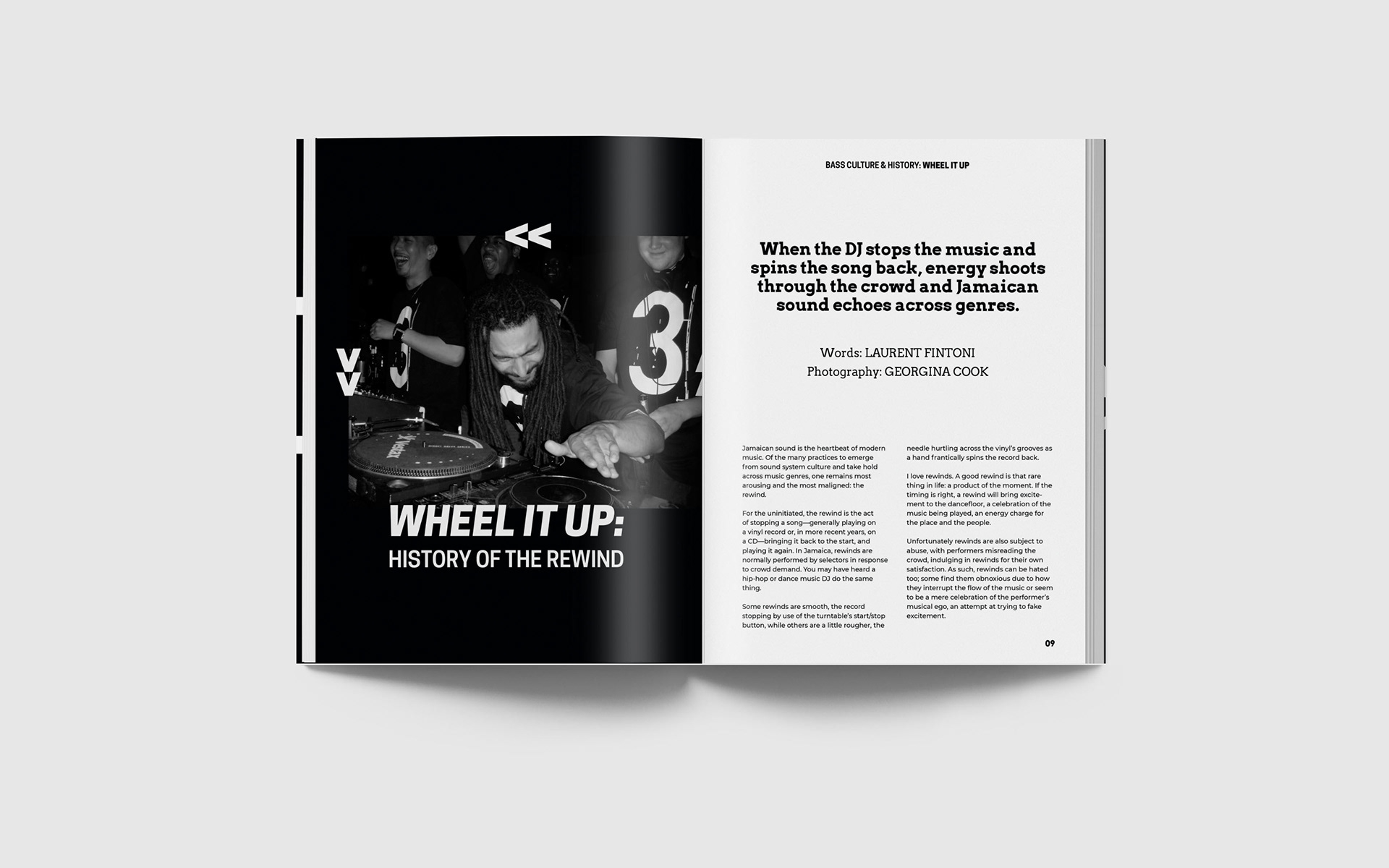
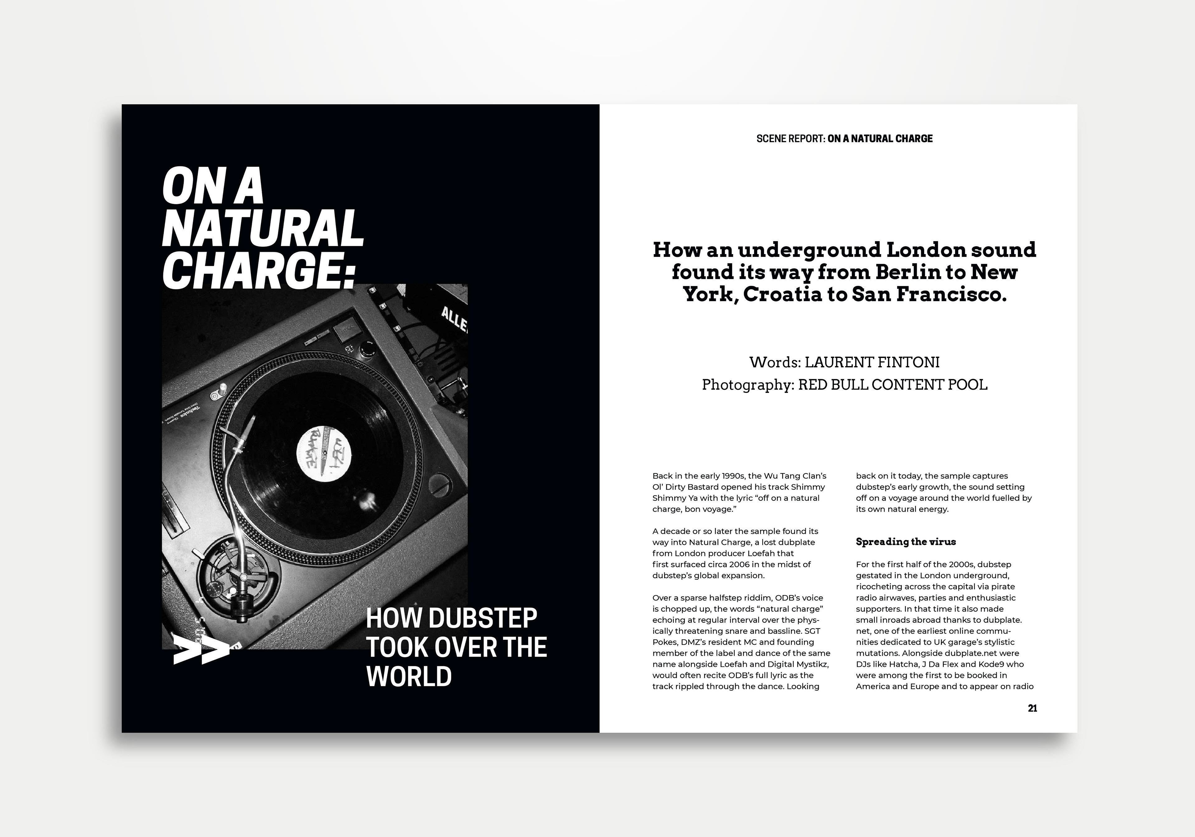
Cooper Hewitt was used in the logo of the magazine, the running headers on all articles, the page numbers, and for the title of all articles in the magazine; Cooper Hewitt Heavy for the main title, and Cooper Hewitt Bold for the subtitle of the article. On all occasions of it being used, the type is set in capital letters, as it better shows the heavy condensed letterforms of the typeface that fits with the visual identity of bass music ephemera, like event flyers.
For the secondary headings, authors, captions, subheadings and quotes, I used the typeface Arvo, which is a geometric slab serif typeface, that renders and reads well even in very small sizes. The geometric features of this typeface and its slab serifs mix well with Montserrat, the typeface used for setting the body copy of the magazine and blog.
GRIDS & LAYOUT
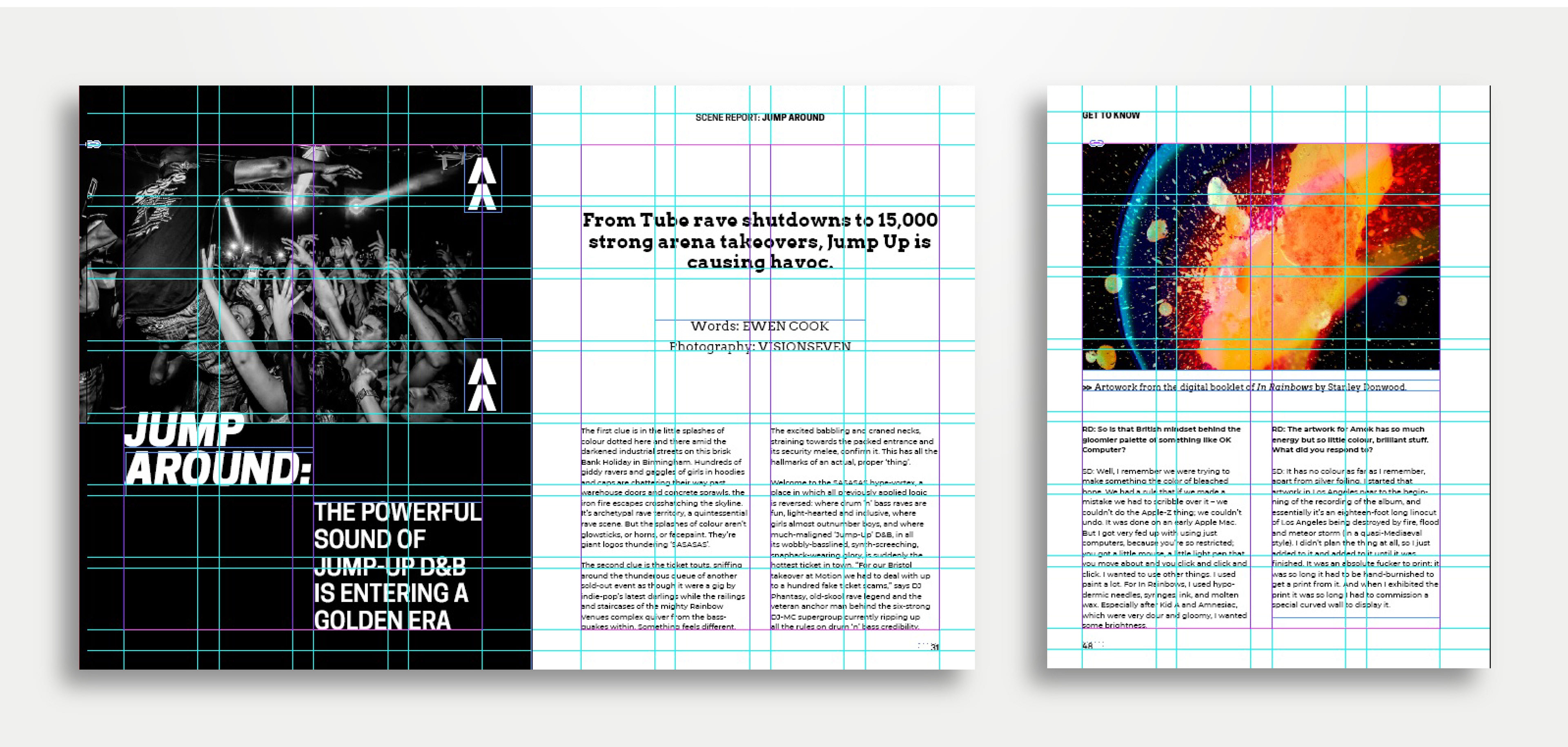
For the grid and layout of the inside pages of the magazine, I divided the 250x190 pages in four columns and seven rows, with plenty of space given between content through wide gitters between them. The grid I used is not overly complicated, which helped me create simple minimal geometric layouts that fit the branding and visual identity of the magazine. I payed a lot of attention in making sure that the pages don’t feel overly crowded and that there’s enough space between the content, to let the photography breathe between the long article essays of the magazine.
Most of the body type is left aligned except the headings on the title pages of each article. Each element on the page is positioned in relation to each other. Wherever there’s photography and images being used, I made sure to align and connect the placement of the text with that of the image, to reinforce the geometric layout of the page.
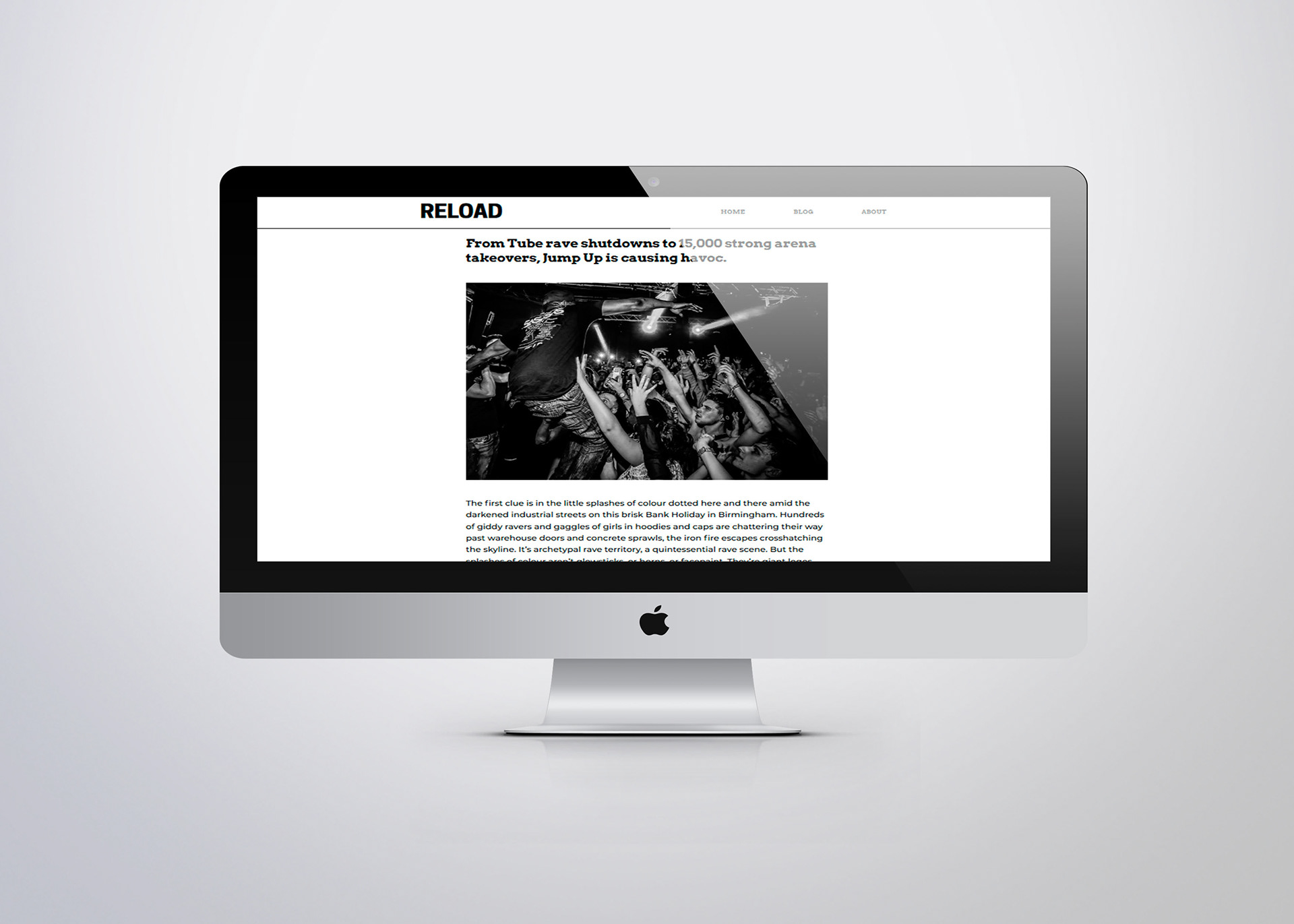
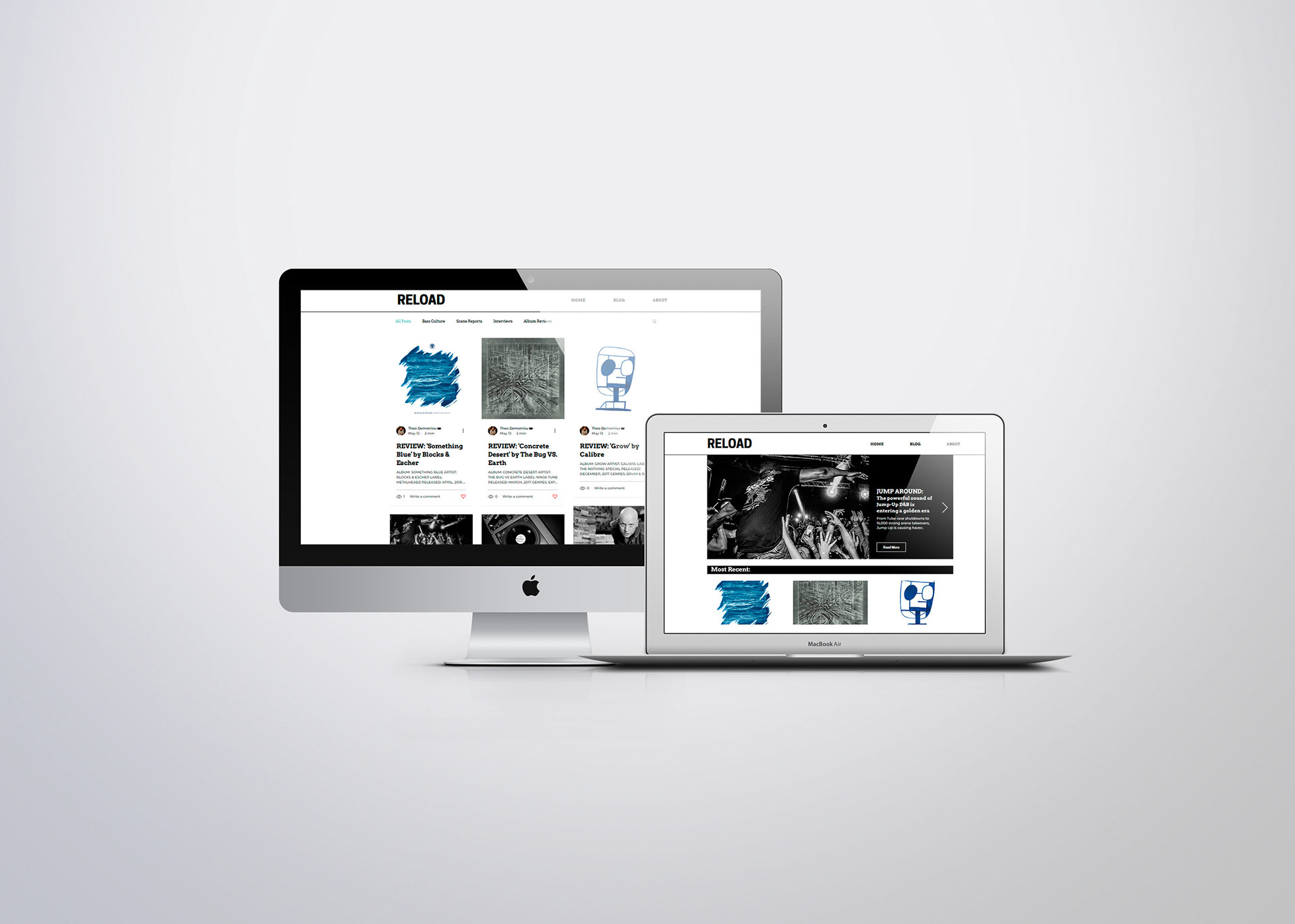
Blog WEBSITE
The blog of the magazine was created using Wix, and editing a blog layout of a premade theme, to fit the branding of the print publication. The colours still remain focused on black & white, with a focus on B&W photography for all the thumbnails. There are no coloured photographs when browsing the website; they are only used inside each blog post.
The header is created using the logo of the magazine, but without the tag line below it, in order to better seperate online and printed content, since the online publication will not only post articles from the printed issues, but also shorted conversational pieces that depend on reader interactivity through the social media and comment functions of the website.
The blog posts are seperated into 5 main categories when browsing articles: Most Recent, History & Culture, Scene Reports, Interviews and Album Reviews. Where there’s a need for more than 3-4 photos in an article, a gallery is created using a carousel, to minimise the length of each blog post.